


Insurello ensure that customers get the right compensation for their injuries. They manage the case from creating the claim through to payout.
Andrew was brought in to improve customer conversion in insurance claims created. This work involved a complete overhaul of the core customer journey, moving to a mobile first design, optimising navigation to improve customer understanding of where they were in the journey and providing reassurance that sensitive data would be handled properly. Insurello also wanted to reduce reliance on their call-centre and become a truly digital business. A successful three month position led to a nine month contract leading the team through the transition.
Andrew worked closely with the project management, development team and copywriter, becoming a trusted member of the team who led the design process. He ran workshops that improved collaboration and communication and increased enthusiasm for the new system. As the UX was being improved Andrew updated the Insurello brand elements, resulting in a bold new look and feel to all customer touch points and paying special attention to accessibility.
In the 30 days following the launch of the new customer journey and brand claims created – the main indicator of success for this project – were up 20% and with vastly improved customer information accuracy.
Insurello website (Swedish)
An easier path to the right injury compensation
INSURELLO

The old Insurello design – in this example for treatment – grew vertically leading to long pages, difficulty in navigating, confusion over in-line and page level messaging and an overwhelming amount of information for customers to absorb at one time.


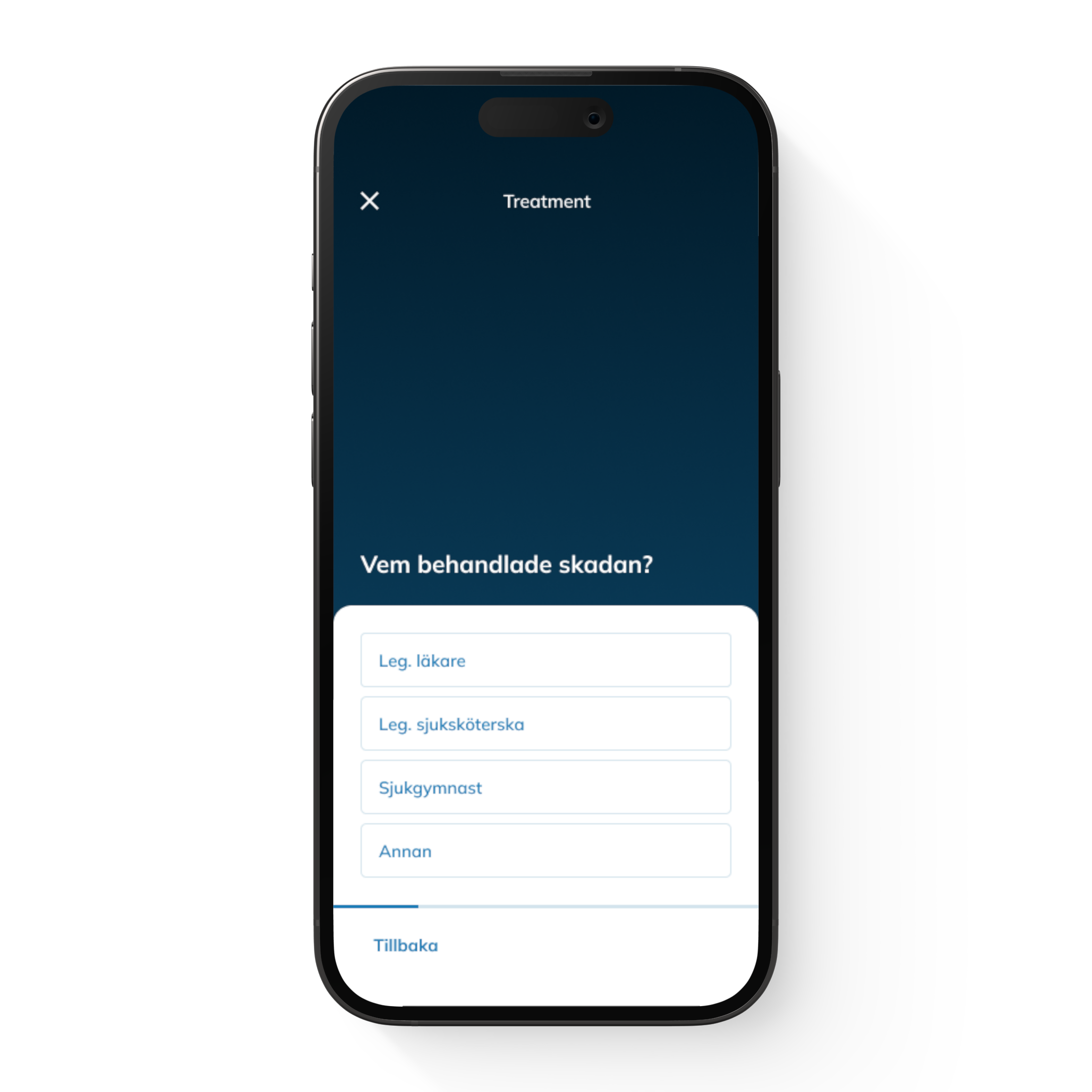
Moving to a one page per question approach made the claims flow feel like more of a conversation – along with many other benefits; we could now easily reorder flows – we moved the injury selector in this instance, vastly improved our findings from A/B and other forms of testing and we could very accurately see where friction and pain points occurred for customers.
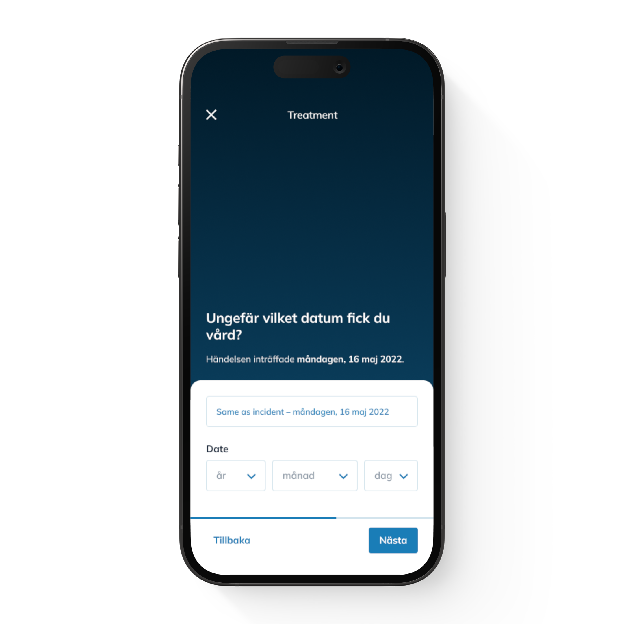
To further improve conversion and accuracy Andrew made sure to reuse previously entered data to avoid customers feeling like they were repeating themselves. Data showed that customers typically sought treatment the same day as they were injured so this was available as a single tap on the date screen.
A simple progress indicator and the ability to exit the flow at any time to return to the ‘My Pages’ screen reassured customers that their information had been saved and made it clear they could return at any time to complete the flow.


Customers struggled to explain the injuries they suffered with some spending up to 15 minutes on this step. Andrew designed a solution that removed confusing medical terms in favour of an injury selector that allowed 75% of customers – fractured skull and wrist – to proceed with one tap. For those that suffered a different or multiple injuries a visual solution was created.


Holding regular workshops meant Andrew could gather feedback from the entire team and make everyone feels their voice was being heard. Regularly updating the print outs with new designs showed the progress being made. Something as simple as leaving a pile of Post-its nearby and inviting everyone in the company to add comments to specific screens or elements at any time was well received and added to the strong feeling of collaboration, ownership and advocacy.

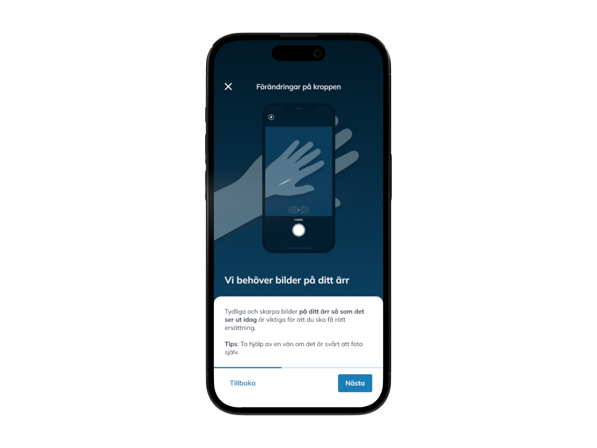
To get the correct compensation it was important that customers take clear photos of their scar. Previously claim specialists at Insurello had been shocked to receive photos of open wounds of recent injuries – not pleasant and not what was required! Andrew introduced a page to educate customers on how to take a well-lit photo, with the scar centred. Above are two designs that were prototyped and user tested.


Isurello had been paying for a third-party signature solution that was expensive, slow, sometimes taking 90 seconds to respond, and clunky. Andrew designed an in house solution that used BankID and worked well in landscape format for longer signatures.

While designing the new UX Andrew saw a need to refresh the Insurello look and feel, with specific attention paid to WCAG guidelines for colour contrast and screen readers. This new look spread to the marketing materials and all areas of the business in a holistic way that was warmly embraced. Andrew created a comprehensive Design System for Insurello as a natural part of the design process.